Developing your DSM documentation
- 25 Jan 2023
- 5 Minutes to read
- DarkLight
Developing your DSM documentation
- Updated on 25 Jan 2023
- 5 Minutes to read
- DarkLight
Article Summary
Share feedback
Thanks for sharing your feedback!
This guide references the new DSM. Built on customer feedback, the new DSM offers a completely redesigned experience. Learn more about why we made the new DSM.
The DSM documentation site is the centralized web view for your design systems. It’s a place where designers, developers, and stakeholders can contribute to your living design system.
Overview
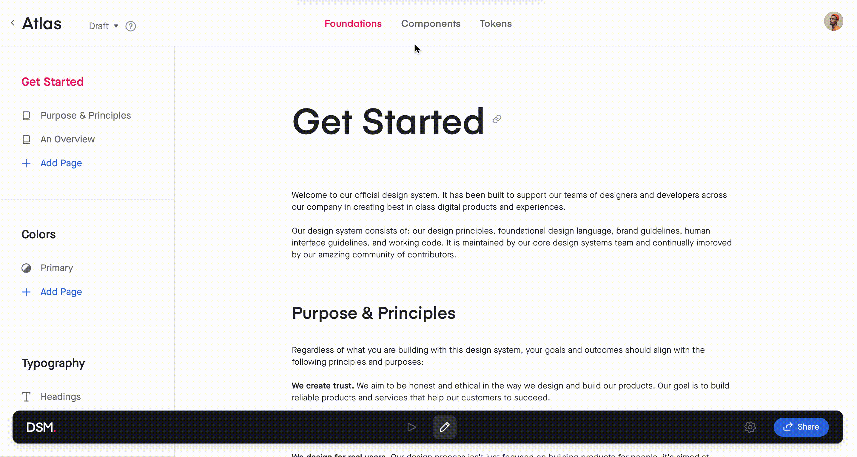
There are four default sections in the navigation bar at the top of the design system:
- Home
- Foundations
- Components
- Tokens
Note: You can customize the top navigation in DSM. Learn more in this article: Hide or show DSM sections
At the bottom of the design system, you'll see a toolbar where you can toggle between Preview and Edit mode, access settings, and share the design system.

Home
The Home section is the landing page of your design system. Here you can upload a home image, edit the title, and add a description.

Foundations
The Foundations section of your design system is where you can add freeform documentation, as well as colors, text styles, and icons from your associated design file.
Note: If you haven't yet synced a Sketch or Figma library to your design system, you'll need to do that before adding any colors, icons, or typography. To learn more, check out our article on creating a new design system.
Documentation
One of the unique features of DSM is the ability to add freeform documentation. It allows you to create brand guidelines, an introduction, do's & don'ts, and any other resources to enhance your design system.
To create a new documentation page:
- Open your design system and, at the top of the page, click Foundations.
- In the left-hand navigation, select or create a new category.
- In the appropriate category, click Add Page.
- Type the page name and press the
Enterkey.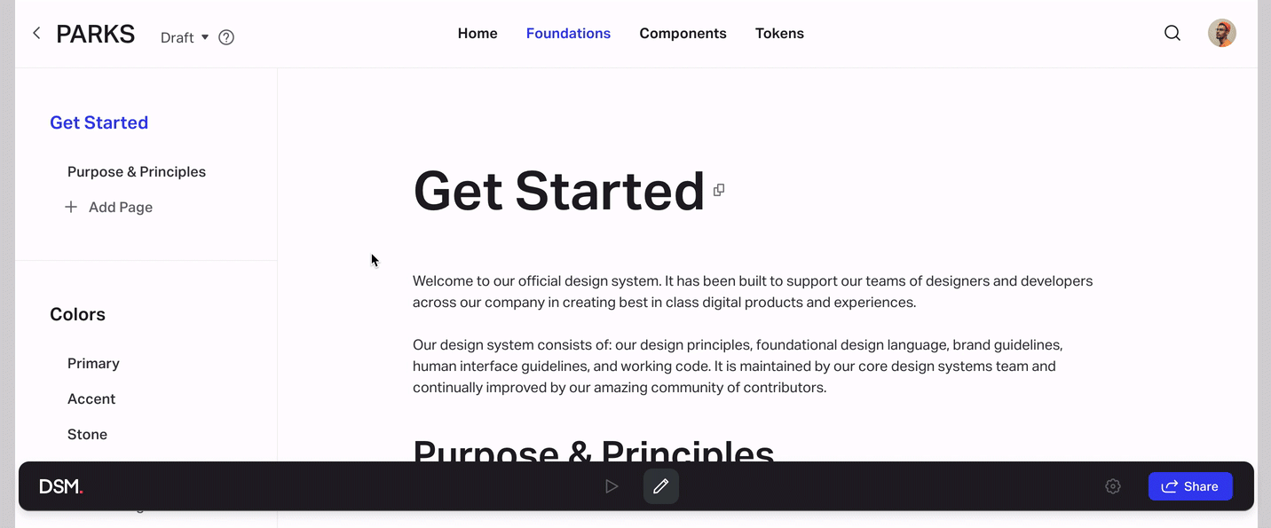

Once you’ve created the page, click the add button (.png) ) to begin adding content. Create a new text block by selecting the description icon (
) to begin adding content. Create a new text block by selecting the description icon ( ). You can also add colors, text styles, and icons to any of the pages by following the steps outlined in the next sections (Colors, Typography, Icons).

When you begin a new line, a small toolbar will give you the option to add images, lists, or code blocks.

Highlight the text to reveal a more robust editor that allows you to add text formatting, headings, links, and more.

Colors
To add color fills from your design library to DSM:
- Open your design system and, at the top of the page, click Foundations.
- In the left-hand navigation, click + Add Page or select an existing one.
- Just below the page title, click the Add button (
.png) ), then select the Color icon (
), then select the Color icon ( ).
). - In the Libraries list on the left, select a library.
- Select the Color Variables or Layer Styles Fills you want to add. Alternatively, at the bottom of the modal, click Select all.
- At the bottom right, click the Add assets button.
 ).
).The colors will appear on the page in a table format. You can repeat the steps above to add a new table.

Typography
To add text styles from your design library to DSM:
- Open your design system and, at the top of the page, click Foundations.
- In the left-hand navigation, click + Add Page or select an existing one.
- Just below the page title, click the Add button (), then select the Typography icon (
 ).
). - In the Libraries list on the left, select a library.
- Select the Color Variables or Layer Styles Fills you want to add. Alternatively, at the bottom of the modal, click Select all.
- At the bottom right, click the Add assets button.
 ).
).The text styles will appear on the page in a table format. You can repeat the steps above to add a new table.

If a sample for a typography style you add doesn't display the correct font, check out this article on adding missing fonts to DSM.
Icons
The Icons category of your DSM documentation site can contain any symbols that you reference on a regular basis, such as system icons, logos, and illustrations. Viewers of your DSM site will be able to download these items as SVGs.
Note: Before adding icons to your documentation site, you must save the icons as symbols and mark the symbol masters for SVG export in Sketch/Figma. To learn more, check out this article: Adding icons to DSM
To add icons to your DSM documentation site:
- Open your design system and, at the top of the page, click Foundations.
- In the left-hand navigation, click + Add Page or select an existing one.
- Just below the page title, click the Add button (), then select Icons (
.png) ).
). - In the left-hand Libraries menu, select a library.
- Select the icons or folders you want to add. Alternatively, at the bottom of the modal, click Select all.
- Click Add assets.
.png) ).
).The icons will appear on the page in a table format. You can repeat the steps above to add a new table.
Icons you add remain linked to the design library. If you change icons in the design library and re-upload the library to DSM, icons you added to the DSM Foundations will be updated automatically.
To download an icon as an SVG, click the Download column for that icon.
.jpg)
Reordering content
Using the toolbar that appears at the top of a table when you select it, you can sort rows manually/alphabetically, show/hide columns, or add more colors to the same table.

To manually reorder an element in the Foundations pages, select it, click the reorder control ( ), and drag the element to a different position. To delete a selected element, click the Remove icon (
 ) on the row’s right-hand side.

Components
Components are the interactive building blocks used to create our product interfaces. They can range in complexity from simple components like buttons to more complex components like multi-step processes or cards.
Before you can add a component to DSM, make sure it is saved as a symbol in your original design library.
If you haven't yet synced a Sketch or Figma library to your design system, you'll need to do that before adding any components. To learn more, read these instructions: Creating a Design System
To add components to DSM:
- Open your design system on the DSM documentation site.
- At the top of the page, click Components.
- If you prefer, create a new category or folder. Within your chosen folder, click Add Page.
- Type the name of your component and press
Enter. - On the Design tab of the component page, click the Add components button.
- Select your symbols to be added as components, and click Add assets.

DSM components allow for incredibly robust documentation. In addition to using the standard text editor available for every element in your design library, you can:
- Add links
- Embed web pages
- Create Live Components with the DSM Storybook integration
Tokens
The Tokens section is where you can build out design tokens documentation that lives alongside all the other elements of your design system.
Further in this product documentation, we talk about what design tokens are, the design tokens practice, and how to manage design tokens with DSM. To learn more, skip ahead to the DSM Design Tokens section.
By default, the Tokens page is hidden from viewers who access a published version of your design system. You can change this setting at any time. To learn more, check out this article: Hide or show DSM sections
Was this article helpful?