Adding Interactivity
- 22 Feb 2023
- 6 Minutes to read
- DarkLight
Adding Interactivity
- Updated on 22 Feb 2023
- 6 Minutes to read
- DarkLight
Article Summary
Share feedback
Thanks for sharing your feedback!
Once you’ve uploaded your screens to InVision, you can use Build mode to create hotspots, overlays, and other interactions.
Creating hotspots
Hotspots link your prototype screens together. Depending on the type (desktop, mobile, etc.), there are various behaviors.
To create a hotspot:
- Open your prototype and navigate to the desired screen.
- At the bottom of the page, click the Build mode icon (
.png) ).
). - Click and drag around the desired hotspot area. You can also use your arrow keys to move your hotspots in Build mode.
- In the hotspot pop-up modal, select the following options:
- Link To: Set the destination screen the hotspot will link to.
- Click/Hover: Determine whether clicking or hovering will trigger the hotspot. Hover is not available for mobile prototypes.
- Maintain scroll position after click: Check this box if you don't want the scroll position to reset after clicking the hotspot.
- Include hotspot in template: Check this box to duplicate a hotspot across multiple screens.
- Click Save.
.png) ).
)..gif)
To resize an existing hotspot, click and drag one of the corners.
Hotspot templates
With hotspot templates, you can create a hotspot once and use it across multiple screens. This is helpful if you have multiple screens that share common links.
To create a new hotspot template:
- Open your prototype and navigate to the desired screen.
- At the bottom of the page, click the Build mode icon ().
- Click and drag around the desired hotspot area.
- In the hotspot pop-up modal, check the box Include hotspot in template.
- Click Create New.
- Enter a hotspot name. If desired, check the box Position relative to bottom of design.
- Directly below the Create New button, click Save.
- After creating the new hotspot template, click Save again.

Once you've created the template, you can use it on any other screen. To add a hotspot template to multiple screens:
- Navigate to the screen with the hotspot template.
- At the bottom of the page, click the Build mode icon ().
- At the top of the page, click the Hotspot Template Applied drop-down.
- Hover to the right of the template name and click the lightning bolt icon (
 ).
). - In the screen drawer that appears, check the screens where you want to apply the template.
- Click Done.
 ).
).You should now notice the hotspot applied to the selected screens.

Background color
When creating a background color for desktop prototypes, InVision uses the bottom corner pixels of the screen to find a match. If you want to change the background, you can set a different color or upload an image.
Note: Currently, you can’t change the background color of mobile prototypes. If you need to adjust the background color of a mobile prototype screen, you must update the screen within the design tool used to create it.
To change the background color of a desktop prototype:
- Open your prototype and navigate to the desired screen.
- At the bottom right of the page, click the configuration icon (
.png) ).
). - In the pop-up modal under Background, you can enter a new hex code or click one of the suggested color swatches. Alternatively, you can upload an image by clicking Upload New.
- If desired, check the box Apply to all current and future screens.
- Click Save.
.png) ).
).
Fixed headers and footers
With InVision V6 you can set fixed headers and footers, adding a level of realism to your prototype.
Desktop
To set a fixed header or footer on a desktop prototype:
- Open your prototype and navigate to the desired screen.
- At the bottom of the page, click the Build mode icon ().
- At the top right of the page, check the box for Fixed Header or Fixed Footer.
- Depending on your selection, a slider will appear at the top or bottom of the screen. To adjust the header or footer size, click and drag the slider.You can also enter a specific pixel distance after checking the box for Fixed Header or Fixed Footer.
After you’ve set the header or footer, click the Preview mode icon ( ) to see it in action.
.gif)
Mobile
To set a fixed header or footer on a mobile prototype:
- Open your prototype and navigate to the desired screen.
- At the bottom of the page, click the Build mode icon ().
- To adjust the header, at the top right of the screen, click and drag the slider.
- To adjust the footer, at the bottom right of the screen, click and drag the slider.Note: If you don’t want a header or footer, drag the slider to the top or bottom edge of the screen.

Fixed elements
To give the appearance of a floating element as you scroll, you can place the element within a fixed header or footer.
Note: At this time, it is not possible to create fixed sidebars.
To create a fixed element:
- In your design file, add empty space to the bottom of the artboard.
- Move your floating element into the empty space. Make sure the artboard background is transparent.
In the above image, we used Sketch to position the floating element. - Upload or sync the screen to your prototype.
- At the bottom of the page, click the Build mode icon ().
- Adjust the header or footer to contain the floating element (see previous section for instructions on setting headers and footers).

To see the floating element in action, click the Preview mode icon ().

Note: To ensure that the prototype remains scrollable, fixed headers and footers are limited to 45% of the screen height.
Interactions
When creating hotspots with InVision, you have access to several essential transition types. Sometimes, however, you need to create a custom interaction that is more elaborate. To do so, we recommend creating a GIF and uploading it as a screen to your prototype. For more information, check out this article: How can I use GIFs for custom interactions?
Timed redirects
With timed redirects, you can automatically transition from one screen to another after a set amount of time.
To create a timed redirect:
- Open your prototype and navigate to the desired screen.
- At the bottom of the page, click the Build mode icon ().
- At the top of the page, click the timer icon (
 ).
). - In the Automatically redirects to drop-down, click the desired screen.
- In the After field, type the amount of time before the screen redirects.
- From the Transition drop-down, choose a motion.
- If desired, check the box Maintain scroll position.
- Click Save.
 ).
).
To turn off the timed redirect, click the timer icon again and click turn off.
Overlays
Overlays allow you to animate one screen over another. Overlays can simulate pop-ups, drop-downs, and other on-screen prompts—all without leaving your current screen. You can also add a hotspot template and repeat these overlays across your prototype.
To create an overlay:
- Open your prototype and navigate to the desired screen.
- At the bottom of the page, click the Build mode icon ().
- Create a hotspot and, from the Link To drop-down, select Screen as Overlay.
.png)
- If working on a desktop prototype, choose Click or Hover.
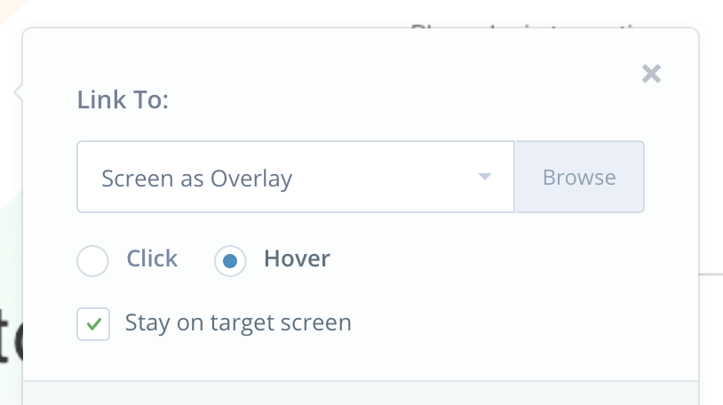
If you choose Hover, an option will appear to Stay on target screen. If checked, the overlay will remain until you click outside the overlay or until you click a Link Back / Close hotspot set on the overlay screen. If unchecked, the overlay will disappear once the cursor moves off the hotspot. Be sure the hotspot is large enough to cover the intended hover area.
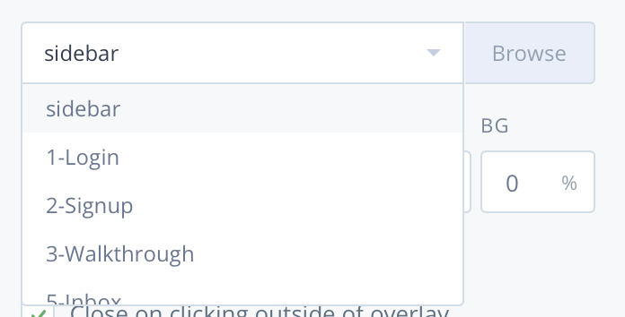
Note: If you don't check Stay on target screen, hotspots within a hover overlay won’t be interactive. - Click the Select a Screen drop-down. Alternatively, you can display the screen drawer—and upload a new screen—by clicking the Browse button.
- To choose your overlay’s location, click the Positiondrop-down. If applicable, use the input boxes to define the distance from the edges.
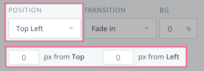 If you choose Custom, click and drag the overlay into place and press Enter.
 - To animate the overlay, click the Transition drop-down. For no animation, choose Instant.
- To set the opacity of the background layer, Click the BG field and enter a percent value. You can also click and drag the slider to adjust the opacity. The background color is pulled from the background color set on the overlay target screen.
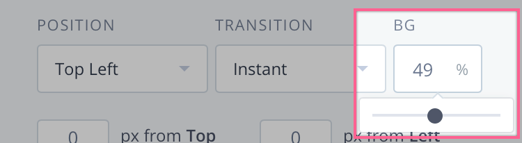
Note: If working on a mobile prototype, make sure the bottom-right corner of your design is the desired color for your background. - If desired, enable these additional settings:
- Reverse transition on Close link: If checked, your transition will animate on both open and close of the overlay.
- Close on clicking outside of overlay: If checked, clicking outside the overlay will return to the underlying screen.
- Fix position of overlay: If checked, your overlay won’t scroll with the rest of the page.
- If desired, check the box Include hotspot in template.
- Click Save.
.png)


You can now test your overlay by clicking the Preview mode icon ().

For more information about overlays, check out this article: What are overlays and how do I use them?
Was this article helpful?